Quick Start Guide
5-Minute Overview
Get SDM Cross Table Tool up and running in just a few minutes with this quick walkthrough.
Step 1: Add the Visual

- In Power BI Desktop, create a new blank report
- Go to Visualizations pane on the right
- Click the three dots and select Get more visuals
- Search for and add SDM Cross Table Tool
Step 2: Prepare Your Data
SDM Cross Table Tool needs at least:
- Row field(s): Categories for table rows
- Column field(s): Categories for table columns
- Value field: Numerical data (usually for mean table) or any categorical variable or measure (usually for percentage table).
Tip: You do not need to prepare specific measure, unless you need to weigth your data. For percentage tables, you can use any categorical field (e.g., Product, Region, Gender, Age class, Segment...) or a measure that returns categorical data. For mean tables, use numerical fields (e.g., Sales, Revenue, Age).
Example dataset:
| Product | Region | Sales |
|---|---|---|
| Product A | North | 15,000 |
| Product A | South | 12,000 |
| Product B | North | 18,000 |
| Product B | South | 14,000 |
With this dataset you can create:
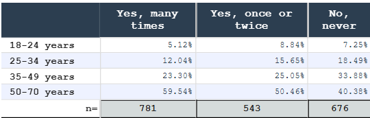
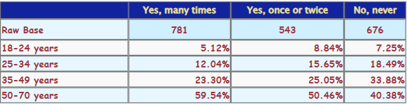
- a cross-tab showing sales distribution of products across regions, in this case, drop any of "Product" or "Region" column in the "value" field and select "Count" measure in the "Values" field.
- a mean table showing average sales per product and region, in this case, drop "Sales" column in the "value" field and select "Average" measure in the "Values" field.
Step 3: Create Your First Table
- Add the SDM Cross Table Tool visual to your report canvas
- In the Visualizations pane:
- Drag a field to Rows (e.g., "Product")
- Drag a field to Columns (e.g., "Region")
- Drag a measure to Values (e.g., "Sales"), select 'count' for percentage or 'average' for mean table.
- Select the appropriate table type in Visual properties
- Your table appears!
Step 4: Basic Configuration
In the format panel, you can immediately:
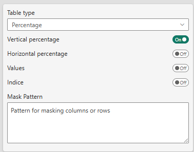
- Table Type: Switch between "Percentage" or "Mean"
- Show Measure: Toggle Value, vertical/horizontal percentages, indice buttons
- Select series usage: Configure multiple value series (e.g., count, mean, std. dev., base, unweighted base...)
- Show Totals: Add row and column totals
- Formatting: Change theme, fonts and colors
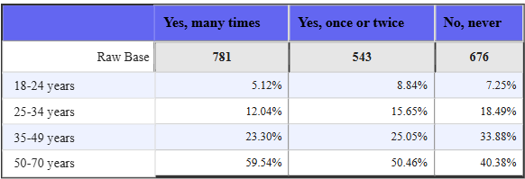
The default format is a 'custom' basic simple table format:

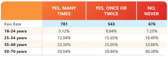
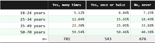
With two click, you can change to other pre-defined styles and color theme like:
-
Classic Indigo:
-
Modern Sunset:
-
Market Research Forest:
-
Scientific Indigo:
-
Or customize your own style:
See Styling Your Table for more details.
Common Configurations
Configuration A: Percentage Analysis
Best for survey data, response rates, market share
- Set Table Type → "Percentage"
- Check Vertical percentage (% within each column)
- Check Show total column
- Enable Zebra rows for readability
Configuration B: Mean Analysis
Best for averages, performance metrics
- Set Table Type → "Mean"
- Configure Mean Series in data properties
- Add Count Series for sample size
- Optional: Add Standard Deviation for analysis
Configuration C: Comparison with Significance
Best for highlighting differences in survey data
- Configure as Percentage Analysis
- In Significance settings:
- Set Significance 1 to "All columns" or "Item vs other"
- Set Significance Level to "95%"
- Select Font Color for display
- Significant differences appear highlighted
Next Steps
To Learn More:
- Explore table features — Detailed step-by-step
- Feature Reference — All available options
- Use Cases — Real-world examples
To Customize:
- Complete Reference Guide — All settings explained
- Specific guides:
Keyboard Shortcuts (Power BI)
- Ctrl+Shift+F5: Refresh visuals
- Click + Drag: Interact with table (if enabled)
- Export: Use Power BI's Export option
Common Questions
Q: My data doesn't appear in the table
A: Check that you've assigned values to Rows, Columns, and at least one Value field.
Q: Can I show multiple metrics?
A: Yes! Drag multiple measures to Values and configure series in settings.
Q: How do I add hierarchies?
A: Drag multiple fields to Rows or Columns to create hierarchical levels.
Q: Is there a data limit?
A: SDM Cross Table Tool follows Power BI's native limits (~1M rows visual-level).
Ready to go deeper? Check out the complete reference guide or explore real-world use cases!