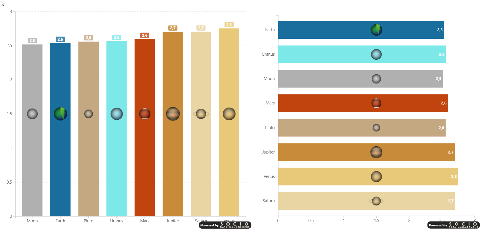
Smart Column Chart
The SDM Smart Column Chart is a versatile bar/column chart visual for Power BI that supports six rendering modes, intelligent data label placement, analytics overlays, and error bars.
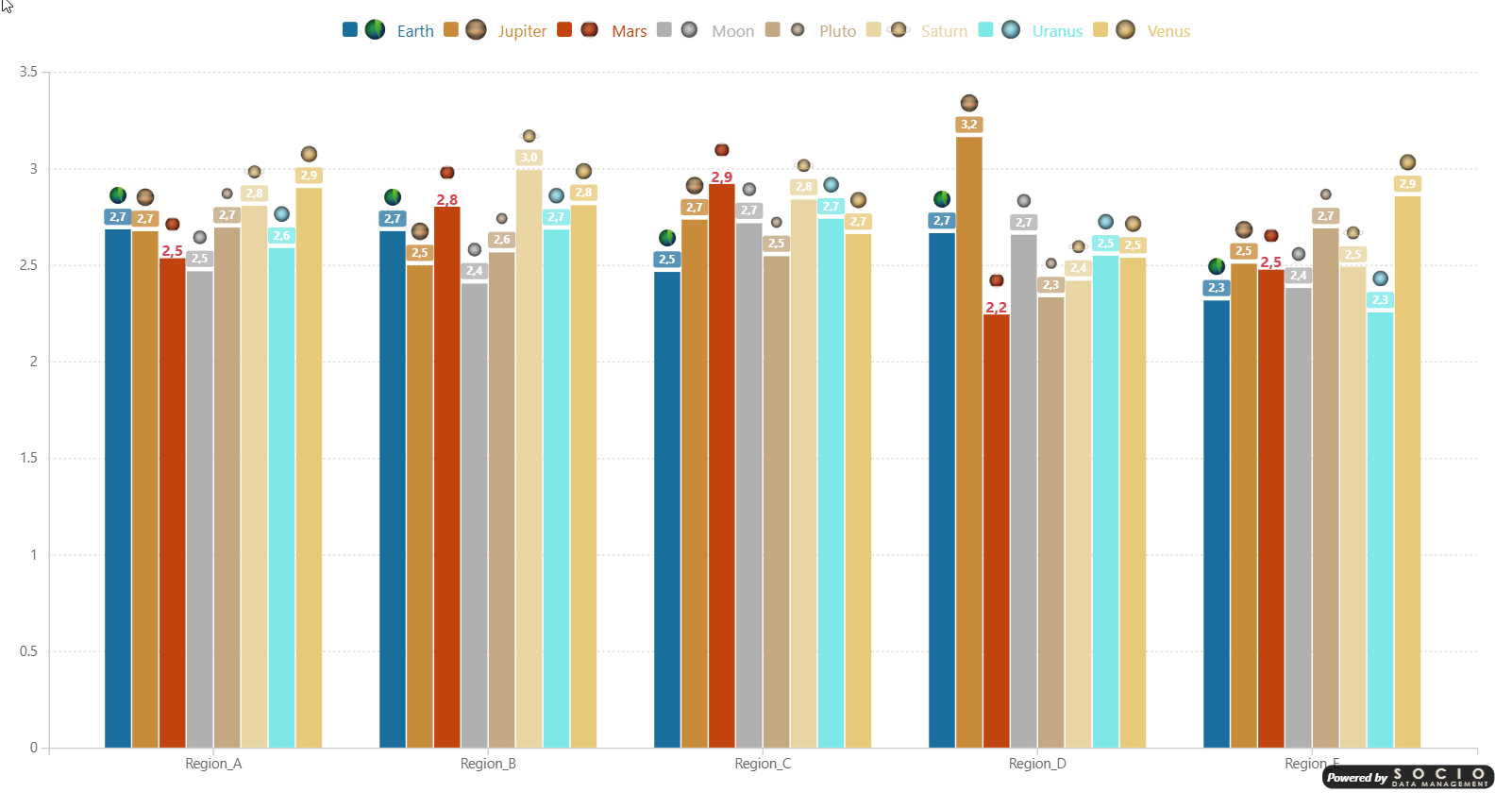
Chart Types
| Mode | Description |
|---|---|
| Column | Vertical grouped bars — categories on X axis, values on Y axis |
| Bar | Horizontal grouped bars — categories on Y axis, values on X axis |
| Stacked Column | Vertical stacked bars |
| Stacked Bar | Horizontal stacked bars |
| 100% Stacked Column | Vertical stacked bars normalized to 100% |
| 100% Stacked Bar | Horizontal stacked bars normalized to 100% |
Data Wells
- Axis — One or more categorical fields for bar grouping. Adding multiple fields creates a multi-level hierarchy axis with drill-down support.
- Values — One or more measures displayed as bars
- Legend — Grouping field to split bars into colored series
- Series Color — Hex color codes per series
- Logo — Base64 images per series
- Error Bar Upper/Lower — Measures for error bar bounds
Multi-Level Axis & Drill-Down
When two or more fields are placed in the Axis well, the visual activates Power BI's drill-down icon in the visual header and renders a hierarchical axis:
- Drill down / Drill up — Navigate one level at a time
- Expand all — Show all levels simultaneously, with bracketed group labels and optional separator lines below the axis
See Multi-Level Axis for full details and formatting options.
Selection & Cross-Filtering
Clicking on bars cross-filters other visuals on the report page.
| Action | Behavior |
|---|---|
| Click a bar | Selects that single data point |
| Ctrl+Click (Cmd+Click on Mac) | Adds or removes individual bars from the selection |
| Alt+Click a bar | Selects all bars of the same series (Legend value) across every category |
| Click empty area | Clears the selection |
Alt+Click is only available when a Legend field is assigned. It is useful for cross-filtering an entire series at once rather than selecting bars one by one.