Bar Settings
The Bar Settings card controls the overall appearance of bars.
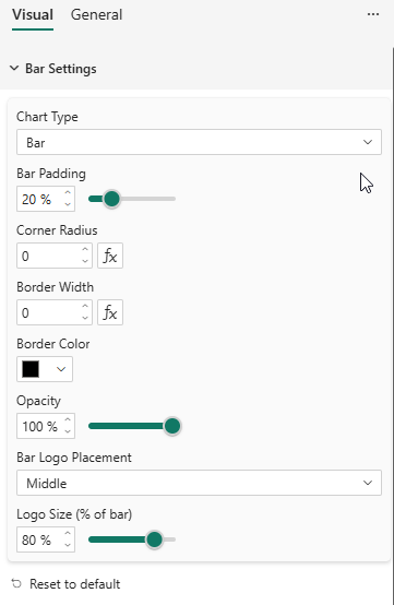
Properties
| Property | Description | Default |
|---|---|---|
| Chart Type | Column, Bar, Stacked Column, Stacked Bar, 100% Stacked Column, 100% Stacked Bar | Column |
| Bar Padding | Space between bars as a percentage (0–80%) | 20% |
| Corner Radius | Rounded corners on bars (px). Supports conditional formatting (fx). | 0 |
| Border Width | Bar border thickness (px). Supports conditional formatting (fx). | 0 |
| Border Color | Color of bar borders | #000000 |
| Opacity | Bar fill opacity (10–100%) | 100% |
| Bar Logo Placement | Where to display series logos inside bars: None, Center, Top, Bottom | None |
Bar Logo Placement
When a Logo is provided in the data, you can display it inside each bar:
- None — No logo in bars
- Center — Logo centered in the bar
- Top — Logo at the top of the bar (right side for horizontal bars)
- Bottom — Logo at the bottom of the bar (left side for horizontal bars)
The logo is clipped to the bar boundaries and respects the Logo Width and Logo Height settings from the Legend card.