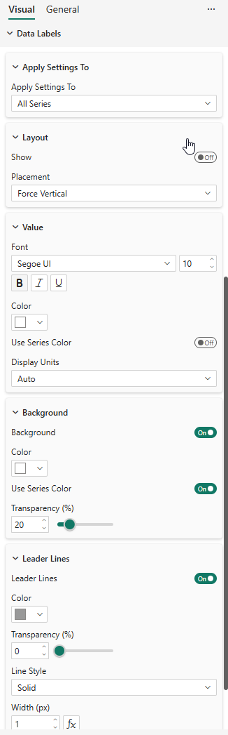
Data Labels
The Data Labels card controls value labels displayed near each data point. All data label settings support per-series customization through the "Apply settings to" dropdown.
Per-Series Settings
At the top of the Data Labels card, a dropdown lets you choose which series to configure:
- All Series — Sets the default values for all series
- <Series Name> — Overrides settings for a specific series only
Series without explicit overrides inherit the "All Series" defaults. This allows you, for example, to show labels only for a specific series, or use a different font size to highlight key data.
Show / Hide
| Property | Description | Default |
|---|---|---|
| Data Labels | Master toggle — enables or disables data labels globally | Off |
| Show (per series) | Show labels for this series | Follows global |
The master toggle at the top of the card turns data labels on or off entirely. Within each series, the Show toggle controls whether that specific series displays labels.
Layout
| Property | Description | Default |
|---|---|---|
| Placement | Force Vertical, Smart Placement | Force Vertical |
Placement Modes
- Force Vertical — Labels are stacked vertically above each data point. When labels overlap, they are pushed downward. Best combined with opaque backgrounds for readability.
- Smart Placement — Labels are positioned intelligently to minimize overlaps. Labels may be placed above or below data points, and displaced horizontally when curves cross through the label area.
Value Formatting
| Property | Description | Default |
|---|---|---|
| Font | Font family | Segoe UI |
| Text Size | Font size in pixels | 10 |
| Bold / Italic / Underline | Text style toggles | Off |
| Color | Label text color | #333333 |
| Use Series Color | Color labels to match their series | Off |
| Transparency | Text opacity (0–100%) | 0% |
| Display Units | Auto, None, k (thousands), M (millions), Mds (billions) | Auto |
The visual also respects the format string defined on each measure in your data model (number of decimal places, currency symbols, etc.).
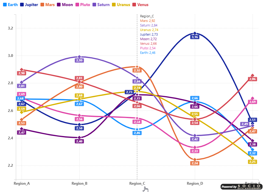
The Use Series Color option (available for both text color and background color) is one of the most impactful settings for chart readability. When enabled, each data label is colored to match its series, making it instantly clear which value belongs to which line — even on dense charts with many overlapping series.
This feature is not available in the standard Power BI Line Chart and can dramatically improve the user experience. Combine it with a series-colored background (see below) for maximum clarity: each label gets a colored badge that stands out against any background.
Background
| Property | Description | Default |
|---|---|---|
| Background | Show a background rectangle behind labels | Off |
| Background Color | Background fill color | #FFFFFF |
| Background Use Series Color | Match background to series color | Off |
| Background Transparency | Background opacity (0–100%) | 20% |
Leader Lines
Leader lines connect displaced labels back to their data points, making it clear which value belongs to which point.
| Property | Description | Default |
|---|---|---|
| Leader Lines | Show leader lines for displaced labels | On |
| Leader Line Color | Line color | #999999 |
| Leader Line Transparency | Line opacity (0–100%) | 0% |
| Leader Line Style | Solid, Dashed, Dotted | Solid |
| Leader Line Width | Line width in pixels | 1 |
Leader lines only appear for labels that have been displaced from their natural position (either by stacking or by smart placement).