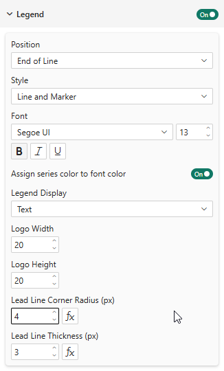
Legend & End-of-Line Labels
Legend Positions
The line chart supports all standard positions plus a unique option:
| Position | Description |
|---|---|
| Top | Legend above the chart |
| Bottom | Legend below the chart |
| Left | Legend to the left |
| Right | Legend to the right |
| End of Line | Labels placed at the end of each line |
End-of-Line Labels
When position is set to End of Line, series names are placed directly at the right end of each line:
- Automatic overlap prevention: When labels overlap vertically, they are spread apart evenly from the center of the cluster
- Lead lines: 3-segment connector lines link each label back to its data point, with configurable corner radius
- Staircase channels: When multiple lines converge, lead lines are routed through separate channels to prevent crossing

Properties
| Property | Description | Default |
|---|---|---|
| Lead Line Corner Radius | Rounding of lead line corners (px) | 0 |
| Lead Line Thickness | Line thickness (px) | 1 |
Enable "Assign series color to font color" to color each end-of-line label with the same color as its series. This creates a strong visual link between the line and its label, making the chart much easier to read at a glance — especially when many series converge. Combined with the same option on data labels and the legend, this gives a fully color-consistent reading experience that is not available in standard Power BI charts.
Logo Display
When Logo data is provided, the legend supports three display modes:
- Text — Color indicator + series name (default)
- Logo and Text — Logo image + series name
- Logo — Logo image only
In End of Line mode, logos appear next to the label text at the end of each line.
Y Axis Range
The line chart supports manual Y axis range overrides:
| Property | Description | Default |
|---|---|---|
| Minimum | Fixed lower bound (leave empty for auto) | Auto |
| Maximum | Fixed upper bound (leave empty for auto) | Auto |
You can set one, both, or neither:
- Both empty — Auto range based on data with 5% padding
- Min only — Fixed lower bound, auto upper
- Max only — Auto lower bound, fixed upper
- Both set — Fixed range, no padding
Unlike the default behavior that always includes zero, the auto range adapts to your data. Data ranging from 38 to 65 will show an axis from ~36 to ~67, not from 0 to 70.