Line Settings

The Line Settings card is organized in two sections: Missing Values and Layout.
Missing Values
Controls how the chart handles gaps when a data point is null or missing.
| Mode | Behavior | Default |
|---|---|---|
| Break line | The line is split — no segment is drawn across a missing point | Yes |
| Direct connection | A straight segment bridges the gap between the last and next real points | |
| Direct dotted connection | Same as Direct connection, but the bridging segments are dotted while real segments keep the chosen line style and curve | |
| Consider as Zero | Missing points are treated as 0 — the Y axis minimum is forced to 0 if data is all positive | |
| Consider as Zero (dotted) | Same as Consider as Zero, but segments touching a replaced (0) point are dotted |
The dotted segments respect the Curve Type selected in the Layout section (Linear, Monotone, Cardinal, Basis, Step) — the line does not flip to Linear just because part of it is dotted.
Layout
Per-series line appearance. Use the Apply Layout Settings To picker to choose between All Series (global defaults) or a specific series to override individually.
| Property | Description | Default |
|---|---|---|
| Line Thickness | Width of the line in pixels | 2 |
| Line Style | Solid, Dashed, Dotted | Solid |
| Curve Type | Linear, Monotone, Cardinal, Basis, Step | Linear |
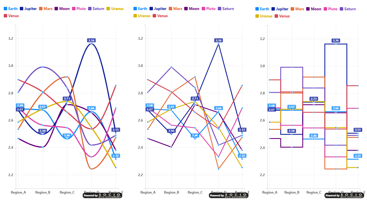
Curve Types
- Linear — Straight lines between points
- Monotone — Smooth curves that preserve monotonicity (no artificial peaks)
- Cardinal — Smooth curves using cardinal spline interpolation
- Basis — Smooth curves using B-spline interpolation
- Step — Stepped lines (constant between points, then jump)
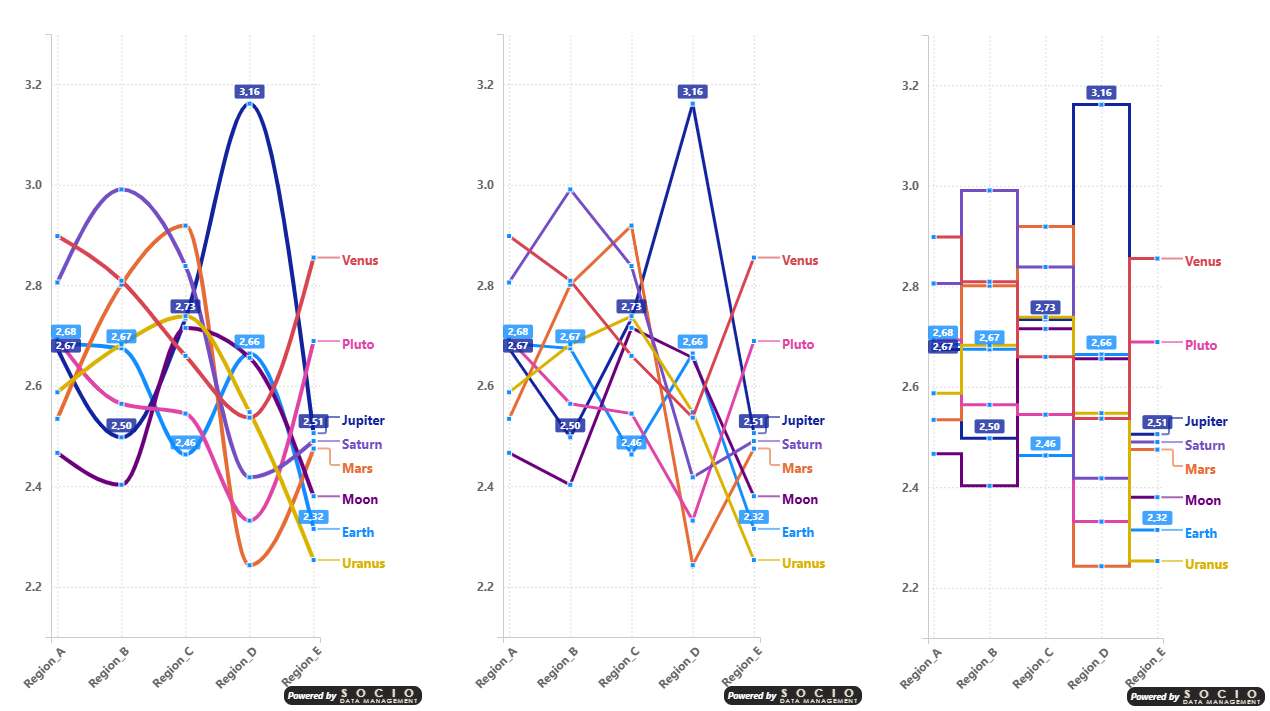
In the examples above, notice two useful behaviors: the X axis labels automatically switch to oblique orientation when horizontal labels would overlap. Also, data labels are intentionally shown for only 2 series out of 9 — this is a good practice to keep charts readable when dealing with many series in limited space.
When the chart area is narrow, the End of Line legend position can consume a significant portion of the available width. In these cases, switching to a Top or Bottom legend position frees up horizontal space for the data, making the chart more readable — as shown in the comparison above.