Axes
The X Axis and Y Axis cards control the scale, tick labels, and title of each axis.
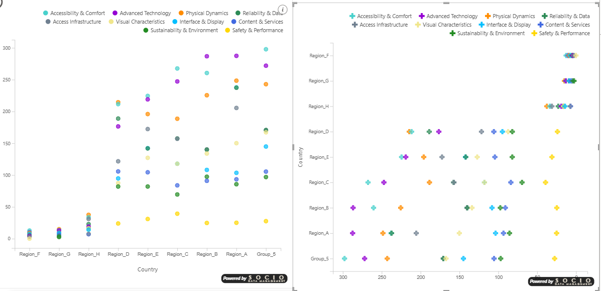
Continuous or categorical
Each axis accepts either a measure or a category:
- Drop a measure (numeric value) → the axis is continuous and behaves like a classic XY scatter scale.
- Drop a column / category (text or discrete value) → the axis becomes categorical: one evenly spaced column (or row) per distinct value, labeled with the category name.
You can mix the two — for example a category on Y and a measure on X produces a horizontal "table rows" layout (one row per category, the measure as the score along X).
Range Min/Max, Logarithmic, Origin, Display Units and Decimal Places have no effect on a categorical axis. Likewise, the zoom inset and the analytic overlays that need a numeric scale (constant lines, symmetry shading, ratio line, min/max/median/average lines) are automatically disabled on the affected axis.
Crossing two categories
Putting a category on both axes turns the scatter into a presence / absence matrix: each cell shows whether a given combination of the two categories exists in the data. It is an effective way to spot which combinations are present and which are missing.
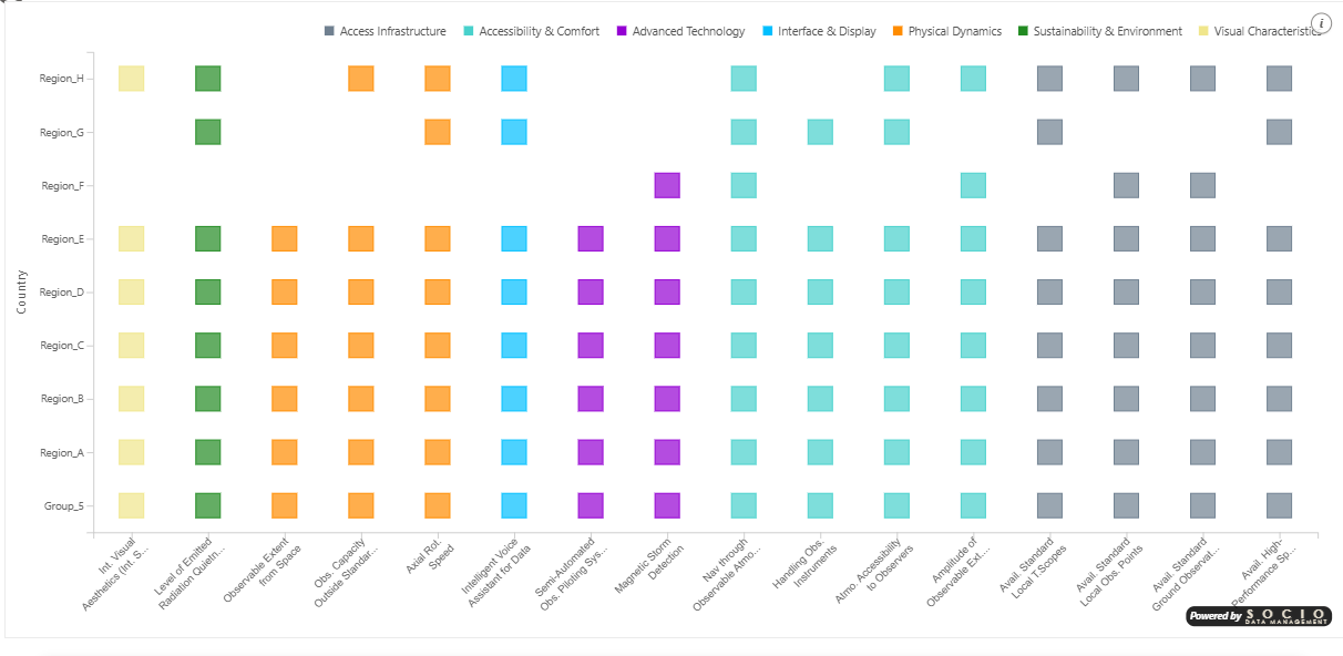
When both axes are categorical, several rows that share the same pair of categories land on the same cell and overlap. That is exactly what makes this a presence/absence view: you read whether a combination exists, not how many rows it contains. Use the Size or Color encodings, or a legend, if you need to distinguish the points within a cell.
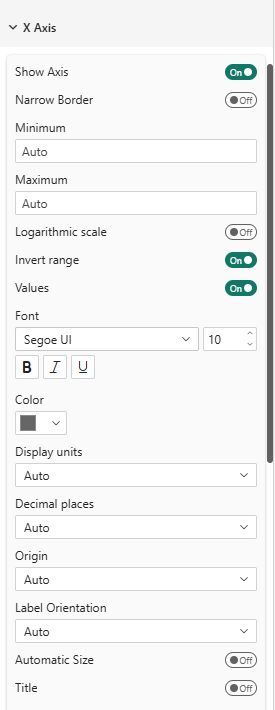
Common Properties
Both axes support:
| Property | Description | Default |
|---|---|---|
| Show Axis | Show or hide the entire axis (line, ticks, labels, title) | On |
| Narrow Border | Remove axis line and tick marks, minimize margins to push labels as close to the viewport edge as possible | Off |
| Range Min/Max (continuous) | Manual axis bounds (leave empty for auto) | Auto |
| Logarithmic (continuous) | Logarithmic scale | Off |
| Invert Range | Reverse the axis direction | Off |
| Values | Show/hide tick labels | On |
| Font | Label font settings | Segoe UI, 10px |
| Units (continuous) | Auto, None, Thousands (k), Millions (M), Billions (Bn), Percentage (%) | Auto |
| Decimal Places (continuous) | Auto, 0–4 | Auto |
| Origin (continuous) | Auto, Zero, Center | Auto |
| Label Orientation (X only) | Auto, Horizontal, Oblique, Vertical | Auto |
| Automatic Size (X only) | Auto-adjust font size to fit available space | Off |
| Show Title | Display axis title | On |
Y Axis — categorical extras
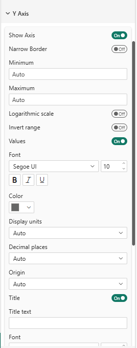
When the Y axis carries categories, two behaviors help with long labels and the "table rows" reading pattern:
| Property | Description | Default |
|---|---|---|
| Row separators | Draw light horizontal lines between category rows for a table-like look | Off |
- Long category names wrap automatically across several lines, vertically centered on their row. The left margin is capped so labels never crowd out the plot area.
- Row separators are drawn on the band boundaries (between rows), so each point stays centered in its own row rather than being underlined.
Categorical columns and rows are spaced evenly: the outer margins are half the gap between categories, and the spacing fills the available width (or height). This is automatic — there is nothing to configure.
Enable Narrow Border on both axes to remove axis lines and tick marks while keeping the value labels. This is especially useful for small visuals or dashboard tiles where every pixel counts. The margins are reduced to the strict minimum — just enough for the label text.
When a measure is formatted as a percentage in your data model (e.g., format string 0%), the axis automatically displays values as percentages (0.25 → 25%). You can also force this behavior by selecting Percentage (%) in the Units dropdown.