Data Labels
The Data Labels card controls the text labels displayed next to each data point.
The scatter plot features intelligent label placement that goes far beyond the standard Power BI scatter chart:
- Automatic positioning — Labels are placed to minimize overlaps with other labels and data points
- Automatic line wrapping — Long labels wrap automatically to avoid extending beyond the chart boundaries
- Series-colored text and background — Use the Use Series Color option on text or background to instantly see which category each label belongs to
Category-Colored Labels — the readability game changer
On a dense scatter plot, identifying which point belongs to which category can be challenging. Enable Use Series Color on the label background to give each label a colored badge matching its category. This feature is not available in the standard Power BI Scatter Chart and dramatically improves readability, especially when points from different categories overlap.
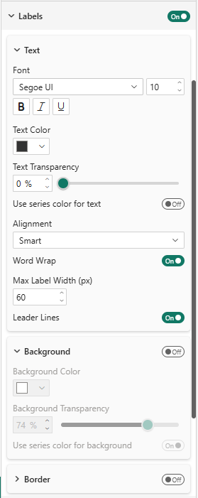
Label Properties
| Property | Description | Default |
|---|---|---|
| Font | Font family and size | Segoe UI, 10px |
| Text Color | Label text color | #333333 |
| Use Series Color for Text | Color label text to match its category | Off |
| Alignment | Smart (automatic) or manual | Smart |
| Word Wrap | Automatically wrap long labels | On |
| Max Label Width | Maximum width before wrapping (px) | 60 |
| Leader Lines | Show connector lines from label to data point | On |
| Background | Show a colored background behind labels | Off |
| Border | Show a border around labels | Off |